Filterable list control panels
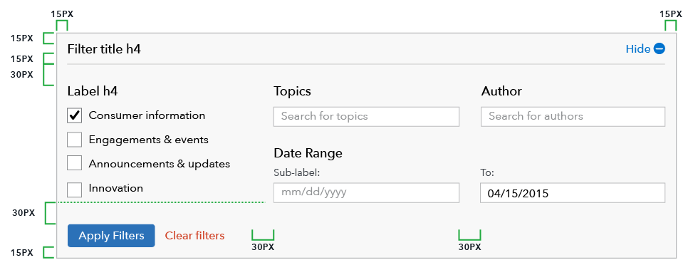
The filter control panel allows users to whittle down number of items in a list to help them focus in on a specific piece of content they may be looking for, or find content relevant to them based on specific filter parameters, housed in an expandable above the list.
Standard filterable list
Use filters in conjunction with search to help users narrow down large amounts of data or content. Follow form patterns for grouping, layout, and messaging. Note that notification messaging sits below the filter and above results.
HTML code snippet
<div id="o-filterable-list-controls" class="o-filterable-list-controls">
    <div class="o-expandable
                o-expandable--background
                o-expandable--border
                o-expandable--onload-open">
        <button class="o-expandable__header" type="button">
            <span class="o-expandable__label">
                Filter posts
            </span>
            <span class="o-expandable__cues">
                <span class="o-expandable__cue-open" role="img" aria-label="Show filters">
                      <svg xmlns="http://www.w3.org/2000/svg" class="cf-icon-svg cf-icon-svg--plus-round" viewBox="0 0 17 20.4"><path d="M16.416 10.283A7.917 7.917 0 1 1 8.5 2.366a7.916 7.916 0 0 1 7.916 7.917zm-2.958.01a.792.792 0 0 0-.792-.792H9.284V6.12a.792.792 0 1 0-1.583 0V9.5H4.32a.792.792 0 0 0 0 1.584H7.7v3.382a.792.792 0 0 0 1.583 0v-3.382h3.382a.792.792 0 0 0 .792-.791z"/></svg>
                </span>
                <span class="o-expandable__cue-close" role="img" aria-label="Hide filters">
                  <svg xmlns="http://www.w3.org/2000/svg" class="cf-icon-svg cf-icon-svg--minus-round" viewBox="0 0 17 20.4"><path d="M16.416 10.283A7.917 7.917 0 1 1 8.5 2.366a7.916 7.916 0 0 1 7.916 7.917zm-2.958.01a.792.792 0 0 0-.792-.792H4.32a.792.792 0 0 0 0 1.583h8.346a.792.792 0 0 0 .792-.791z"/></svg>
                </span>
            </span>
        </button>
        <div class="o-expandable__content">
            <form method="get" action="#">
                <div class="content-l">
                    <div class="content-l__col
                        content-l__col-1">
                        <div class="o-form__group">
                            <div class="m-form-field">
                                <label class="a-label a-label--heading" for="o-filterable-list-controls_title">
                                Search by keyword(s)
                                </label>
                                <input type="text" name="title" id="o-filterable-list-controls_title" class="a-text-input a-text-input--full" maxlength="250">
                            </div>
                        </div>
                    </div>
                    <div class="content-l__col
                        content-l__col-1-3">
                        <div class="o-form__group">
                            <div class="m-form-field">
                                <label class="a-label a-label--heading" for="o-filterable-list-controls_categories">
                                Category
                                </label>
                                <div class="o-multiselect">
                                    <ul class="o-multiselect__choices"></ul>
                                    <header class="o-multiselect__header"><input class="o-multiselect__search a-text-input" type="text" placeholder="Select up to five" id="o-filterable-list-controls_categories" autocomplete="off"></header>
                                </div>
                            </div>
                        </div>
                    </div>
                    <div class="content-l__col
                        content-l__col-1-3">
                        <div class="o-form__group">
                            <div class="m-form-field">
                                <label class="a-label a-label--heading" for="o-filterable-list-controls_topics">
                                Topics
                                </label>
                                <div class="o-multiselect">
                                    <ul class="o-multiselect__choices"></ul>
                                    <header class="o-multiselect__header"><input class="o-multiselect__search a-text-input" type="text" placeholder="Select up to five" id="o-filterable-list-controls_topics" autocomplete="off"></header>
                                </div>
                            </div>
                        </div>
                    </div>
                    <div class="content-l__col
                        content-l__col-1-3">
                        <div class="o-form__group">
                            <div class="m-form-field">
                                <label class="a-label a-label--heading" for="o-filterable-list-controls_language">
                                Language
                                </label>
                                <div class="o-multiselect">
                                    <ul class="o-multiselect__choices"></ul>
                                    <header class="o-multiselect__header"><input class="o-multiselect__search a-text-input" type="text" placeholder="Select up to five" id="o-filterable-list-controls_language" autocomplete="off"></header>
                                </div>
                            </div>
                        </div>
                    </div>
                    <div class="content-l__col
                        content-l__col-1">
                        <div class="content-l">
                            <div class="content-l__col
                                content-l__col-2-3">
                                <div class="o-form__group">
                                    <fieldset class="o-form__fieldset">
                                        <legend class="h4">
                                            Date range
                                        </legend>
                                        <div class="content-l">
                                            <div class="content-l__col
                                                content-l__col-1-2">
                                                <div class="m-form-field">
                                                    <label class="a-label a-label--heading" for="o-filterable-list-controls_from-date">
                                                    From:
                                                    </label>
                                                    <input type="date" name="from_date" class="a-text-input a-text-input--full" placeholder="mm/dd/yyyy" data-type="date" id="o-filterable-list-controls_from-date">
                                                </div>
                                            </div>
                                            <div class="content-l__col
                                                content-l__col-1-2">
                                                <div class="m-form-field">
                                                    <label class="a-label a-label--heading" for="o-filterable-list-controls_to-date">
                                                    To:
                                                    </label>
                                                    <input type="date" name="to_date" class="a-text-input a-text-input--full" placeholder="mm/dd/yyyy" data-type="date" id="o-filterable-list-controls_to-date">
                                                </div>
                                            </div>
                                        </div>
                                    </fieldset>
                                </div>
                            </div>
                        </div>
                    </div>
                    <div class="content-l__col
                        content-l__col-1
                        m-btn-group">
                        <button class="a-btn" type="submit">
                        Apply filters
                        </button>
                        <a class="a-btn a-btn--link a-btn--warning" href="#">
                        Clear filters
                        </a>
                    </div>
                </div>
            </form>
        </div>
    </div>
</div>
Specs

Use cases
When to use
- When presenting more than 20 documents or listings together for users to browse through.
- Users interacting with content will want to focus their searching activities on this specific group of content, rather than using the general site search.
- Data has relevant characteristics to filter on, for example product and issue for complaint data, location and property type for HMDA, date range and categories for articles
When other options are better
- The total amount of content can be skimmed in a list of 20 items or less.
- Characteristics available as filter options, such as topics, dates, and categories, are not relevant to the content.
- Search alone is sufficient for user needs
Guidelines
Content guidelines
- Headings and labels should be as succinct as possible, ideally 10 characters or less. Do not use colon (:) or other punctuation after the header.
- Help text in text fields should be 40 characters or less.
- Answer options beneath heading should also be succinct, roughly 25 characters or less.
- Headings and answer options should be sentence case (unless specifically proper nouns or titles)
Behavior
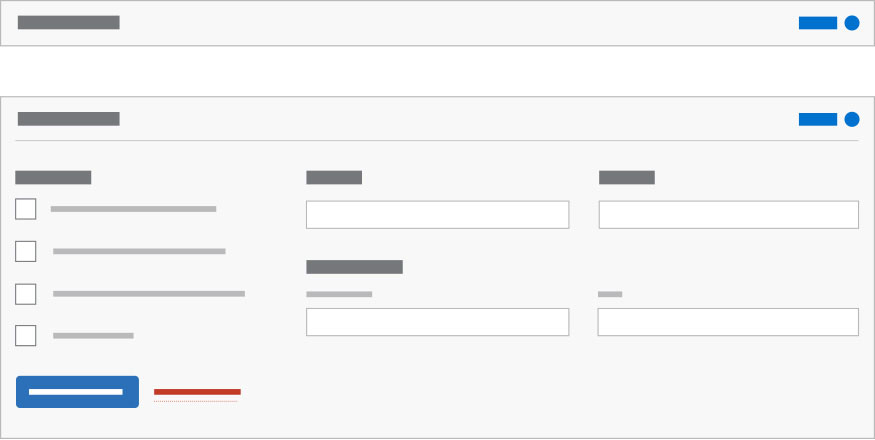
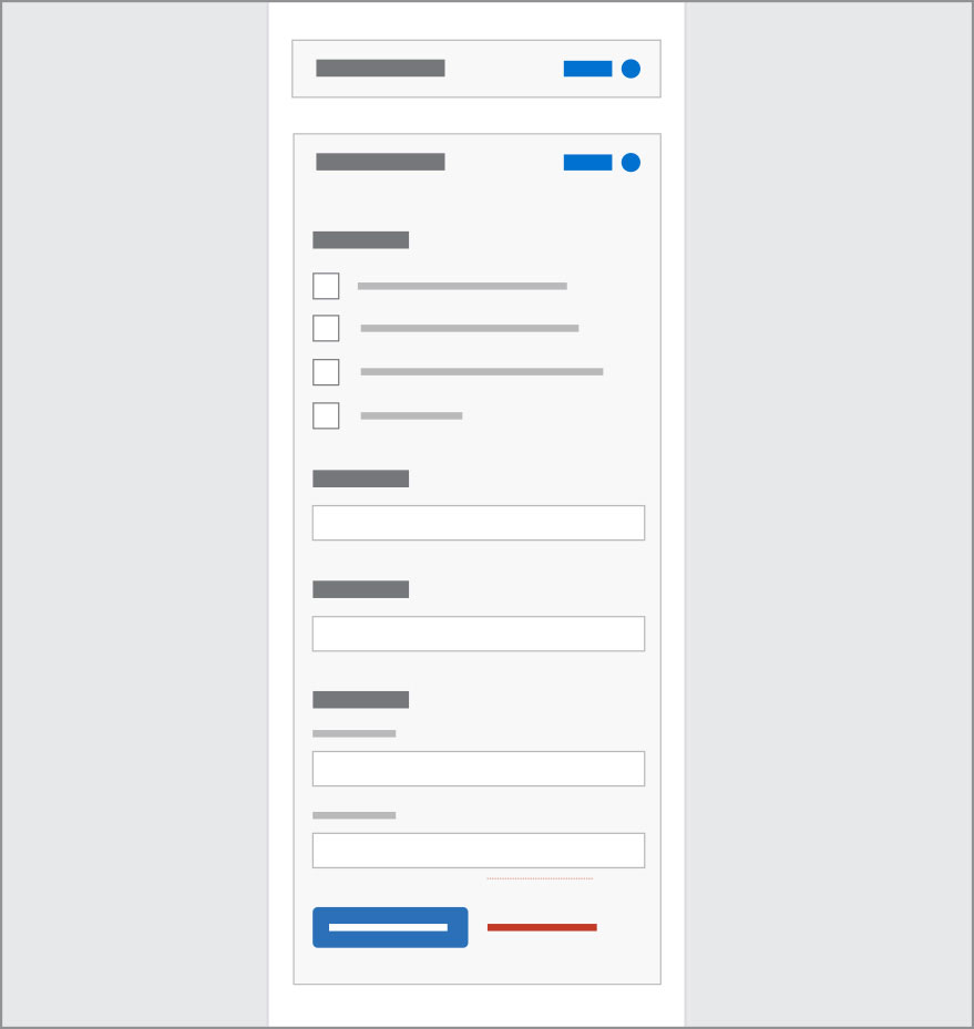
Maximum three column wide layout. Options stack vertically below 601 pixels.
| Above 600 px | Below 601 px |
|---|---|
| 2-3 columns | 1 column, stacked |
 |
 |
Filters live in an expandable style element allowing controls to be hidden when not in use or needed.
On page load, the filter is collapsed by default. After filter is applied it remains open, except for mobile breakpoint (< 601 px) where is is collapsed after filtering to make vertical space for the notification to be viewed on screen.
When a user applies a filter setting, a notification automatically appears below the panel indicating number of results or errors.